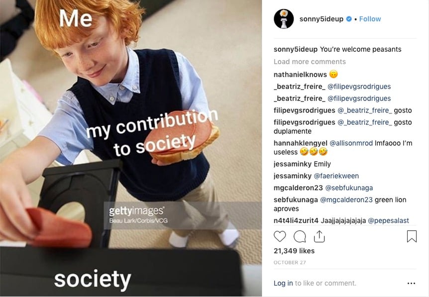
We all know what traditional bad stock looks like.
It’s become a cliché. It’s become meme-able...

But we’re beyond all that, aren't we? I mean, if you're using that kind of stock, fine. It has its place.
Stock has evolved.
Stocky-stock (AKA bad stock) has also been changing with the times. If you don’t look close enough, you might mistake it for a valuable image. Aesthetics have grown and changed and along with them so has the entire stock world.
Still, you can spot a stocky-stock image when you see it. It might be coated with some decent light and maybe the styling isn’t that bad, but you can still see the awkward interaction of the models a mile away. The props on the table appear as though they are evidence at a court trial. In the morning scene, you know her hair definitely didn’t look like that when she woke up.
As someone in a creative field, you are certainly adept at spotting these details. But even your clients, who may not have as much experience with images, can notice stuff like this too. My mom sends me images all the time that are offensive to her. To her credit, she's also starting to send me images she likes (and asks if they're ours - thanks mom). She’s a retired school teacher.
Stocky = unnatural, fishy, unconvincing.
These are words you certainly don’t want to be associated with your creative. The font you painstakingly chose, the direction you fought for and the colour palette you lost sleep over can be derailed by a stocky image. Granted, sometimes budget can have a huge constraint on what imagery you can use. However, if you pay attention to getting these 5 key elements right, you’ll get what you need every time:
1. Expressions and body language.
In the scene you’re depicting, do the people look like they should be there? If it’s a photo of a barista behind a bar, does it look like they know what they’re doing? They’re working, should they REALLY be smiling gleefully down at that steamed milk? (hint: No. No, they shouldn’t.) If they are talking to their co-worker, can you tell they’ve been pulling morning shifts together for months, or can you tell they just met each other a few minutes before the photo was taken?
2. Styling.
Honestly these days, less is more. If you notice any of these things before hunting for them, that’s a red flag. Do you see a lot of baristas wearing puffy blouses? Or do they typically throw on something they know will get dirty? And you know she just throws her hair up in a loose bun, not a perfectly coiffed power style.
3. Lighting.
This is where things start to get a bit tricky. Lighting seems to be a subjective thing but really it’s not. Any shadows in there that shouldn’t be? Do you see way too much detail in every nook and cranny of the space? Could the image be on the page of a Wal-mart flyer and not feel out of place? Trust your eye. Your eye knows if the light looks natural or not.
4. Cast.
This is pretty straightforward but easy to get wrong. There are two things that affect this – first, the actual look of the model (let’s let the runway models do their thing on the catwalk). Your clients want to see themselves (or really, an ideal version of themselves) in your creative. Secondly, how at ease/relaxed does the model appear to be in the image? Sometimes it’s best that the cast is not aware of the camera, they're just doing their thing.
5. Location
This one’s so easy it’s almost not worth mentioning. Is that barista photographed in an actual coffee shop? If so, great! If not, then move on. There are lots of images of baristas.
Of course, there are exceptions to everything. But the majority of the time, if you want to find natural, convincing images then follow these guidelines and you’ll be fine. Shop our site for the images you need. We have a curated collection - all shot by us - ensuring that you won't be fooled by stocky stock!